Archive

Multimedia Journalism

ApplePhotosApple’s new Photos app has a clean interface and seems to be faster at moving through large volumes of photos.

But it offers almost no new photo editing capabilities, leaving the app as a so-so beginner-level photo processing tool.

What’s worse, Apple is trying to tie it to a new iCloud photo sharing scheme that will cost most users $20 per month for a service of limited utility.

Thankfully, there are better, cheaper alternatives.

Apple Photos is intended to replace both iPhotos, the venerable photo editing app that comes free with all Macs, and Aperture, a more advanced software program aimed at professional photographers. It also shares more of the look and feel of Apple’s photo apps on the iPhone and iPad, making it easier to move from one device to another.

The look and feel of the new program is completely different from iPhoto. Gone are the gray backgrounds, replaced by a clean white design.

You can’t just go to the Apple store and download Photos. It is part of the latest update (10.10.3) to Apple’s operating system, Yosemite. It took me about 45 minutes to download and launch the upgrade and then when I launched Photos, it took another hour to load the 10,000 photos from my iPhoto library.

Right off the bat, you’re asked whether you also want to upload your photos to Apple’s iCloud remote storage system. The advantages of doing so seem obvious, but Apple does not tell you what it costs, at least not at this point in the process. If you do upload your photos, they are then accessible from any other Apple device you own, such as an iPhone or iPad. The actual photos reside on Apple’s servers, but a thumbnail is downloaded to your devices, so the shared photos don’t take up all of your limited iPhone or iPad storage space. When you click on the thumbnaijl, an image sized appropriately for your device is downloaded. In addition, when you edit one of the photos, the edited version appears in seconds on all of your other devices.

It’s a cool feature, but I question whether it is worth the money. Money? Did I mention what this costs? Apple gives you 5 gigabytes of storage for free. For $1 per month, you get 20 gigs; for $4 you get 200 gigs; or $20 for a terabyte. That sounds reasonable (I paid $100 annually for the old dot.mac service), but consider the competition. Google gives you 15 gigs for free, and 100 gigs for $1.99. A terabyte will set you back $10 a month, half what Apple charges.

But why pay at all when Flickr gives you a terabyte for free? Yep, venerable old Flickr, owned by Yahoo, wants NOTHING for the privilege of storing your photos. Flickr has an app for your iPhone or iPad so you have access to all of your photos on any device. Yes, there are limitations: Flickr has no editing tools whatsoever, so you have to clean up your photos elsewhere and then upload them. And no, if you edit your photos on your home computer or iPhone, the edits don’t show up elsewhere.

But how often do you edit your photos anyway? Not much? Then none of this matters. You’re looking for the lowest price and free beats not-free. You regularly do heavy editing? Then Photos is not very useful to you anyway.

Photos has basic photo editing options. You can crop the photo, adjust the color to get rid of the blue tint you got from standing too close to a fluorescent light, get rid of red-eye, and change the white and black levels to sharpen the contrast. There are adjustments for sharpening the focus, adding some silly Instagram-ish tints, lightening shadows and darkening highlights.

But all of these adjustments apply to the photo as a whole. If your subject is sitting in front of a window and silhouetted by the bright back-light, you can lighten their face, but only by brightening the overall image. You can’t just go in and lighten only the face.

Adobe’s Photoshop allows you to do this and that’s one of the reasons it is the gold standard of photo editing. Photoshop has multiple selection tools, so you can choose and manipulate every element in an image. In addition, Photoshop allows you to superimpose one image over or under another and then play with the way they combine. Or you can clone one part of an image to cover up something else, an often under-appreciated feature. Don’t like the light switch sticking out of your subject’s head? Just clone the blank wall adjacent to the switch to cover it up. Or if the color is uniform, select the paint tool and paint it away.

Photos has no such tools. In fact, it has nothing that really improves on its predecessor. And the tools it does have are hidden where many users won’t find them.

Open Photos and go to the main screen to edit your images and you may be baffled. Apple design guru Jonny Ives loves to strip down products to their most basic form, but here he has pushed form over function and the result is a botch. if you look long enough, you’ll see a very small “Edit” button at upper right. Click on that, and you will see links to seven options: Enhance, Rotate, Crop, Filters, Adjust, Retouch and Red-eye. Five of them, Rotate, Enhance, Red-Eye, Crop and Retouch, are all part of the Quick Fixes in the old iPhoto. I stared at them for a long time trying to figure out if that was all there was. Eventually, after clicking on each option several times, I noticed that when I clicked on the Adjust link, an Add link appeared at upper right. What could that possibly lead to?

Oh my! An entire set of advanced photo editing tools are all here, buried two clicks deep. The Add button allows you to add a Histogram plus Sharpen, Definition, Noise Reduction, Vignette, White Balance and Levels options to your screen. Closer examination, however, reveals that none of this is new. The old iPhoto also had an Adjust option, but it was in a large tab at the top, next to Quick Fixes and Effects. In iPhoto you get your histogram, and you can adjust for Sharpness, Definition, and to tweak Noise, Exposure, Contrast, Saturation, Highlights, Shadows, Temperature and Tint. I haven’t compared every option, but they seem identical even if a couple of labels have been changed.

So where does that leave us? Basically, back where we started. iPhoto, an under-achieving photo editing tool, has been replaced by Photos, which strives for no higher ground. Perhaps Apple has a secret project to create a serious rival to Photoshop, which has angered many semi-professional users by switching to a monthly rental fee to access the program.

Photos is certainly not that alternative. Yes, it appears to be faster than iPhoto, but it offers no improvements for editing. That’s a disappointment, given the Mac’s tradition as the world’s premier graphics computer. There are promising alternatives (see our review of Affinity’s Photo, above) and my bet is that several challengers to Adobe will soon appear on the scene. It’s too bad that Apple is not among them.

ScreenGrab

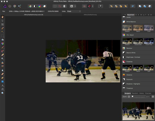
Affinity Photo, a new image manipulation app released in beta last month, just may be what Adobe-hating Photoshop users have been looking for — a professional level photo editing program that does not require a monthly payment to Adobe.

Let me be clear at the outset here — I love Photoshop. It is a wonder and has been my favorite app since the first time I saw it at a trade show in Atlanta way back when it would only work in black and white.

What I don’t like is Adobe’s pricing scheme, that requires me to pay a monthly fee instead of outright selling me the program. Yes, I know, I can get Photoshop alone for as little as $10, per month, at least for now, but I would be locked in to Adobe, and if for some reason I decided not to pay, whoosh — Photoshop no longer works on my computer.

There are a number of rivals to Photoshop out there such as Pixelmator or GIMP or even Photoshop Elements. But none of them are full-featured professional image editing programs.

So that’s why I’m intrigued by Affinity, which I’ve been trying out over the past few weeks. It’s not (yet) a Photoshop killer, but it has a depth of features that should have the folks at Adobe looking nervously over their shoulder. If this is what is in the beta, then where will the program be in a couple of years?

First off, go download the free beta yourself. It seems to be bug-free and most everything is working.

I had two main impressions when I first opened the program: 1) This looks a lot like Photoshop, and 2) Wow, there are a lot of features.

The left side of the screen really resembles Photoshop’s tool bar, from the arrangement of the tools right down to the icons. Click on the Blur icon, e.g., and out pop alternate choices for Sharpen and Smudge, just as in Photoshop.

On the righthand side of the screen, however, things are different — there are icons that duplicate much of the functionality of Photoshop’s Adjustment menu. Click each one and an adjustment option opens, with a slider to change the intensity of the effect.

At the top right is a row of abbreviations. Click each one and the menu below changes. In addition to the Adjustments menu I just mentioned, there is one for a histogram, color, swatches, brush shape and hardness, layers, effects such as bevel and glow, a styles option that I can’t figure out, and a link to Shutterstock for stock photos.

One nice improvement over Photoshop is a “before/after” toggle for most of the options that lets you drag a vertical bar left and right to preview and review the effect.

I use Photoshop CS6, primarily to edit photos, and in several days of playing with Affinity Photo, I haven’t discovered any feature in Photoshop that I’m missing in Photo, although I’m certain there are some, because both programs offer so many options.

Affinity Photo also has a series of “personas” or modes that offer additional functionality. A Liquefy persona overlays a mesh over your image, allowing you to warp portions of it. There is a Develop persona that is still in development and apparently offers features for Camera Raw editing. And there is a Sharing persona that allows you to export your image. The logic for making these features “personas” doesn’t seem clear. Editing Camera RAW images seems to be a major feature set, while the Warp feature is very similar to other relatively minor menu items. And there is yet another icon, this one NOT a persona, that offers a range of options to determine how objects snap to a grid or to each other.

That’s my one reason for caution in recommending Affinity Photo. I’ve gone through most of the menus and clicked on the icons and adjusted sliders on several dozen effects, but I have not come close to testing all of the options in the program. it seems to meet my needs for photo editing, but your experience may differ. But the current free beta seems like a great opportunity to find out.

The pricing for Affinity Photo has not been set, but Serif, the company behind the program, already offers Affinity Designer, an Illustrator alternative that launched in June, for $49.99. I think it is certainly worth a try. Adobe badly needs some serious competition.

WhereWeEat

Well, at least the basic version is free.

Go to vennage.com to sign up.

They have a lot of basic templates for charts and a decent selection of infographic templates as well.

For $19.95 per month, you get a few more templates, in particular, a map of the U.S. that allows you to display data for each state, plus the ability to publish your graphic as a pdf file. Of course, with the free version you can just do a screen grab and embed that. With the free version, you can only have five infographics live at a time, which might crimp your style for regular usage, but isn’t an issue for occasional work.

The graphic above is one I created for a class, using some data from a Google Forms survey asking students where they ate on campus in the previous week.

Every part of the template is customizable, generally by clicking on the element, which opens up a panel.

If you’ve discovered a better free or inexpensive tool for creating charts and infographics, let me know.

FacesInWindow
In 1902, long before any sign of Ebola or the creation of the Centers for Disease Control, a small cluster of hospital buildings on a little more than 25 acres of land in the middle of New York harbor were the main U.S. defense against infectious diseases carried by the millions of immigrants streaming into the country from all over the world.

Most of us know the story of the main processing building on Ellis Island and its cavernous hall where some 12 million people were screened before being sent on their way into Manhattan, New Jersey, or points farther north, south or west.

But about a tenth of those immigrants, some one million, only made it off the island after spending time in the two-story cluster of brick and plaster buildings directly across a small harbor from the main building — the island’s medical facilities. Bustling in the 20 years of the island’s heyday, the examination rooms, ward rooms, kitchen, power plant, mortuary and even the prim Victorian home of the superintendent were abandoned in the 1950s, with much of the buildings’ furnishings remaining in place,

In their day, they were staffed by some of New York’s top doctors and they arguably included the best-trained and most knowledgeable infectious disease experts in the U.S. And they had to be, given the range of diseases that found their way from all corners of the globe past the Statue of Liberty to Ellis Island, the largely man-made stopping point built up in part by dumping debris from NYC’s newly-dug subway lines.

Think of it as an early version of today’s TSA airport screening.

The first step in the medical screening was a spiral staircase in the main building, specially requested by the doctors, who could thereby evaluate the incoming immigrants from all angles before they were even aware that they were under observation. Anyone who had difficulty climbing that one flight of stairs drew immediate attention.

If the doctors believed further investigation was needed, they put a mark on the immigrants’ clothing and sent them out from the main building down to the right through the ferry terminal, into the Y Hallway.

The hallway got its name from the way it divided at its eastern end. To the left, a corridor led to the wards where pregnant women and anyone who seemed to have mental problems were examined. To the right were the infectious disease wards, where nurses and doctors could evaluate whether their disease would soon run its course or whether the immigrants should be sent back to their homeland. Most only stayed a few days, but a couple, suffering from the lingering effects of tuberculosis, remained on Ellis Island for more than a year, too sick either to be sent back aboard ship or allowed into the U.S.

Only a handful failed to get entry to the U.S., a little over one percent. Some 3,500 died on the island of their illnesses, most buried in a pauper’s grave near Rikers Island, unless they were fortunate enough to have their body claimed by a local relief organization from their particular religious or ethnic group.
Save Ellis Island, a non-profit group, has now been given permission to conduct tours of the abandoned medical facilities, limited to about a dozen visitors at a time. For signup information, go here.
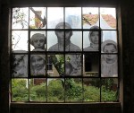
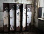
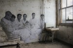
An added treat — the French artist known as JR has enlarged a number of vintage photos of immigrants on Ellis Island and superimposed them on walls, windows and doorways at various points in the tour, bringing the hallways and ward rooms to eerie life.

FirestormIn “Firestorm,” an exceptional multimedia look at how a Tasmanian family escaped a devastating wildfire, The Guardian gets right what the New York Times couldn’t figure out in its Pulitzer Prize-winning epic, “Snowfall.”
__________________________

Read/watch ‘Snowfall’ here.

Read/watch ‘Firestorm’ here.
__________________________

There are two reasons “Firestorm” is so much better than “Snowfall” — One, The Guardian team rejects interactivity (letting readers control the story) and instead uses advanced web coding to force the reader to experience ALL of the mutimedia, along with the text, as they progress through the story. And secondly, The Guardian team really understands the power of video, blending that video with text in a compelling fashion to ask whether one family’s race to escape a fast-moving fire may portend Australia’s future in the face of climate change.

In “Snowfall”, the Times told the story of how three members of a group of veteran off-trail skiers in Washington State’s Cascades died in an avalanche.The project was notable for its extensive use of multimedia, some CSS tricks, and of HTML5, the latest upgrade in Web coding standards.

The 17,000-word text was peppered with photo galleries, video clips and links to audio interviews, and each section of the narrative began with a short video loop showing snow falling or clouds moving over a mountain landscape. Several 3-D maps clarified the terrain where the tragedy occurred and a particularly effective bit of animation displayed the avalanche as it occurred, in real time.

But The Times project merely glommed those impressive multimedia elements onto the text. There was never any doubt which medium was dominant. You might stop reading to watch a video clip or animation or to scroll through a photo gallery, but then you went back to the text.

The dead giveaway was where The Times stuck their mini-documentary, an 11-minute video narrative. The video was compelling, capturing the grandeur of the Cascades, the drama of the avalanche, the sorrow of the survivors. And where did The Times put it? Dead last, at the every end of those 17,000 words.

If the video had been at the beginning, where TV-based Web sites such as NBCNews.com would have put it, then who would have read those 17,000 words of text?

My point is not to criticize the placement of the video so much as to point out that the Times did two separate versions of the story — one in video and the other in text, with some multimedia elements thrown in.

What they did not succeed in doing was to combine those elements into one narrative.

The Guardian’s “Firestorm,” on the other hand, melds text and audio and video in a way that fulfills the 15-year-old promise that the Web will usher in a new form of multimedia storytelling.

In “Firestorm,” you don’t alternate between text and video. The text is overlayed on the video. A photo filling the entire screen scrolls up and comes to life — a family member explains when they first realized that the flames were a threat, a firefighter tells of the futility of fighting such a gigantic firestorm.

And then the video ends and it’s time to scroll down for more text. In “Firestorm,” text doesn’t try to do what video does best — capture the emotions of the trapped family, describe the look of the flames as they top a nearby ridge, or show the devastation of the fire.

Photos of the family, as they huddled beneath a pier in the lake below their burning house were featured by the news media across Australia in stories about the fire. In “Firestorm,” that is mentioned, but the text never describes the photos. Instead they are shown, while mom tells how, even as the flames crept closer to the dock where she and her children were huddled, she realized she had her cellphone and asked someone to take some photos.

The point is a simple one, but critical — The Guardian staff understands that with video, the images tell their own story. There’s no need to add text.

In The Times “Snowfall,” in contrast, reporter John Branch seems to have written his story with no thought of any accompanying media. A female skier, who was caught in the avalanche but thanks to a safety vest survived, explains in a video how she thought she was dying. And sure enough, the text repeats the same quote. Branch writes eloquently of the joys of skiing in thick powder snow, while, a few column inches away, a well-shot video clip does a far more effective job of showing that joy.

“Snowfall” was an eye-opener, an intriguing showpiece of what you can do with HTML5, video and 3-D graphics. But if “Snowfall” showed the potential, “Firestorm” is the realization of that potential.

The video and photos don’t sidetrack a reader from the print narrative — they are part of the narrative. In “Snowfall,” the text worked as a standalone story, as did the 11-minute video. Drop either element, and the other was just fine. Not so in “Firestorm.” Finally, someone has used coding so the authors can be sure that readers have read and seen all of the multimedia elements as they move through the story instead of tacking photo galleries or video clips or interactive maps on the side, with no assurance that anyone is looking at them.

For the past 15 years, those of us in the multimedia storytelling business have promised more than we have delivered. “Rashomon”-like, we’ve told a story from different perspectives — hey, look at my video, here are some photo galleries, maybe an interactive map and, of course, a text story that stood on its own. Each medium provides one look at the story, in ways that TV or print publications can’t do, but ultimately they haven’t really worked together.

With “Firestorm”, The Guardian shows the way to true multimedia story-telling.

Now if someone on their team will just lay out in detail exactly how each element worked, so the rest of us can learn from them.

UPDATE: When I wrote about the value of Flipboard’s user-created magazines a couple of days ago, one of my major complaints was that folks could see them only if they own an iPad, smartphone or Android tablet. Well, the FB folks have fixed that. As of today, I (or any other FB user) can mail you a link to my magazines or post a link on social media, and when you click, the magazine opens in your Web browser. This vastly expands the utility of the magazines, since you can now let anyone see them. Here are links to three of my magazines, on Web Video,  Photos, and Data Visualization.

My purpose in creating these is to collect stuff on a given topic that I can then use in class, and now I can use FB’s web page to organize each magazine and then mail links to it to students at the beginning of class.

HINT – Once you open one of my magazines, click on the small icon at left with three short parallel lines. That will take to FB’s choice of best user-created magazines.
___________________________________________________________

I’ve been using Flipboard’s new “Create Your Own Magazine” feature for about three months now, so it’s time to report on how it’s working.

I’m basically very happy with the software, that allows you to store your Web page bookmarks as “magazines” on Flipboard, displayed in the software’s unique layout.

For now, Flipboard is only available for iPads and iPhones, Android, and Windows 8 phones. The basic application allows you to select feeds from Twitter, Facebook or various magazines and pull them into Flipboard. The app then displays the headline, photo or illustration, and the first 1-3 grafs of the content, laid out magazine-style, with 2-6 items on a page. You turn the pages by sliding your finger from right to left, “flipping” them.

FlipboardCover

It’s a far better way to browse a Twitter feed featuring links or photo, e.g., because you don’t just see the url — you see the actual photo or article headline, along with the first few paragraphs of the text. Content from several dozen Web sites, including The Economist, Salon, National Geographic and The Guardian, are also available, in the same format.

But about three months ago, Flipboard announced a new feature that allows readers to create their own magazines. First, you set up your magazines, by title and category. For example, I created magazines for Photos, Data Journalism, Web Video, Teaching, Journalism, Mobile apps, Gadgets and Music.

Now, as I browse content on Flipboard, a small plus sign is visible to the side of every article, and if I want to save it in one of my magazines, I just click.

Far more powerful, however, is a Pinterest-like feature that allows me to add a link to my Firefox or Safari browser. With that installed, whenever I am browsing anywhere on the Web, I can click on the “Flip” link and a window pops up, allowing me to add the link to one or several of my magazines.

You may be asking how this is any different than just storing the URLS for those Web pages in my bookmarks folder. At a basic level, there is no difference. I generally add both a bookmark and “flip” the link to my Flipboard magazine whenever I find something of interest.

But Flipboard’s magazine-style layout makes it much easier to find a URL long after you’ve forgotten why you saved it. By displaying the headline, photo or video or illustration and the first few grafs of a story, you can quickly remember what the article is about.

Here’s a quick illustration of that comparison. Below is a screen shot of my bookmarks folder for Web video (OK, I could do a better job of organizing it):

BookmarksWebVideo

Now here are several pages from my FB magazine for Web video:

FB5

Your magazines by default are public, so they can be followed by anyone else interested in your topic. At some point, for example, I could send a note to my fellow online journalism professors across the land, letting them know that I have collected several hundred links to great examples of web video, available for their classroom use.

photo

Flipboard has already made one upgrade to the service. About six weeks ago, they announced a Web page where you can log in and edit your magazines. You can drag and drop each item into whatever order you like, and you can also create a permanent title page for your magazine (by default, Flipboard uses the art from your most recent post as the cover page art).

FB7

There are still some missing pieces for Flipboard to be more useful. I’d like to be able to write new headlines for the articles, e.g., and I’d like the ability to create subsections. For example, in my Photos magazine, I’d like to have one section for great examples of photos, another for photo gear, and a third for how to take photos.

And most importantly, I’d like to be able to share the content on the Web and not just on a tablet or smartphone. Most of my students have laptop computers, but almost none of them own a tablet computer.

Apr 11, 2013, 3-53-06 PMIf you’ve glanced at fashion Web sites lately you may have noticed a striking new image — what appears to be a still photo, but with a small portion moving, seemingly in a loop.

The images are called “cinegraphs,” a name copyrighted by photographers Jamie Beck and Kevin Berg, and they first started using them in 2011.

One of the first examples was during Fashion Week in New York City that year (click on New York Fashion Week): http://cinemagraphs.com/

They seem to be gaining mainstream acceptance. Here’s a recent example from People magazine.

http://www.people.com/people/static/h/package/mostbeautiful2013/gif/index.html

Here’s a good overview article with lots of good links:

http://columbianewsservice.com/2013/03/wait-did-the-picture-in-that-ad-just-move/

I decided to show my multimedia news production class how to produce them, which required learning the process myself. (One of their best is the one of the two flags at the top of this post). There are two approaches, one using Photoshop (I’m guessing you could also do it in GIMP or Photoshop Express, not sure about Pixelmator) and the other using an app for an iPad, iPhone or Android tablet or smartphone.

Here’s an Android app:
http://www.makeuseof.com/tag/make-animated-gifs-and-cinemagraphs-android/

Here’s the iPhone and iPad equivalents:

Echograph.com
Cinegram.com

https://itunes.apple.com/us/app/cinemagram/id487225881?mt=8

The app approach is much simpler, though it doesn’t offer all the capabilities of Photoshop.

My guess is that we will see a lot more cinegraphs because coming up with a good one takes some thought, the sort of process that both video and still photographers enjoy.

First, you need at least two elements of your image that are moving. The goal here is to freeze one of them and let the other continue to move. But you need to be careful that none of the elements in the frozen portion of the image move behind the image you want to move. When an element is moving, it swings from side to side or up and down, revealing part of the background and if anything moves through that background, it will spoil the effect. So your moving element should be in front of something that is stationary. That was a problem in the third-from-the-bottom image below, where the runners ran behind the young woman. We had to freeze the right side of her skirt, since when it blew to the left, it would reveal the runners when they passed behind her.

Your frozen image also takes some thought. You want the reader to recognize instantly that some of the elements in it were moving but now have been frozen. In the bottom image in this post, e.g., it is not immediately obvious that the young woman is not just sitting very still. In the one above it, on the other hand, it’s clear that the person walking has been frozen while his shadow precedes him.

With an app, such as Echograph, the real headache is in getting the video into and out of your smartphone or tablet. That requires loading the video into your computer, opening iTunes, selecting the Apps window, and scrolling down to where data can be transferred via iTunes from your computer to the app, and then loading the video (the folks at Echograph are also selling an SD card reader that attaches to the phone or tablet, allowing you to transfer the files directly from your camera).

But the process of creating the cinegraph is idiot-proof. Open the app, open the video and hit Play. Stop when you find the frame you want to freeze and then, using your finger, erase over the part you want to continue moving. Voila! Instant gratification and you can share your creation via e-mail or social media.

Photoshop is harder, but offers more options. I didn’t realize you could import a video into Photoshop, but you can. Under the File menu, select Import and you can select “Import Video to Layers.” That puts each frame into a separate layer and you can even trim the front and back of the clip to reduce the file size. You then need to stack the layers, add a mask over the part you want to reveal and after a few more steps, create your cinegraph.

It’s a complicated process, but it offers two advantages over the app version. First, in Photoshop you can select your frames and then paste them in, in reverse order, so your video moves forward and backward to the beginning in a smooth-flowing loop. The app versions also play the video as a loop, but at the end of the clip, there is a jump cut back to the beginning. By reversing the frames, the image seems to be in perpetual motion. Secondly, in the apps, you use your fingertip to reveal the underlying image. That’s normally sufficient, but it doesn’t offer the pixel-level control of Photoshop.

Here are the detailed instructions:

http://blog.spoongraphics.co.uk/tutorials/how-to-make-a-cool-cinemagraph-image-in-photoshop

One other point – you absolutely must use a tripod. If one part of your image is frozen, any camera shake at all in the moving portion will be accentuated.

Here are a few of my favorite images from our class:

Apr 11, 2013, 3-50-26 PM

Apr 11, 2013, 11-19-29 AM Apr 11, 2013, 11-30-54 AM Apr 11, 2013, 11-04-22 AM


We did Hack Jersey this weekend at Montclair State (see my previous post for links) and one of my tasks was to stream the proceedings. We posted 5 1/2 hours to YouTube, including all of the speeches, the teams’ presentations to the judges, and the awards presentation, and I learned a lot.

The good news: For what we were doing, the results were acceptable. By myself, using three laptops and two Logitech webcams, and the WiFi available on campus, we managed to stream all of the speeches, intercutting each speaker’s Powerpoint (or HaikuDeck) slides and using a second laptop as a second camera.

Our setup: I attached a Logitech HD external webcam ($199) to my MacBook Pro laptop, mounted on an inexpensive (Velbon) tripod. We had a 10-foot USB extension cord which was critical in allowing me to move the camera close to the podium, while I sat 20 feet away (the webcams also have a 10-foot cord). I asked all of the speakers to e-mail me their presentation deck. Google Hangouts allows you to switch between your webcam (either the one embedded in your laptop or an external webcam) and your computer screen. So you can show the speaker and then cut to his/her slides as needed. The audio came from the microphone on the Logitech Webcam, which necessitated keeping that camera close to the podium.

That basic setup worked well, and for most of the presentations would have been sufficient. Except…..

Since this was a hack-a-thon, it seemed appropriate to push things a bit, so I decided to add a second camera. With Google Hangouts, you typically log-in on your computer and invite friends to join by sending them an e-mail with a link to the Hangout. They click the link and you can see each other, via the built-in webcam (assuming you have one).

But you can add an external webcam. You simply plug it in, and then in the Hangout, there is an option to choose the camera and microphone to use (you may need to reboot the computer to get the external webcam to show up). So you can point that external Webcam anywhere, particularly if it it is mounted on a light-weight tripod and has a 10-foot USB extension cord.
That’s the minimal setup you need to do a decent job of covering a speech at a conference.

To add a second camera, you need to invite somebody else to join your Hangout. You simply send them an e-mail, they click to join, and they show up, on their webcam. But if they have an external webcam, that becomes your second camera.

Google allows 10 participants in a Hangouts, so if each one had an external camera, you could have a 10-camera shoot. So if a hurricane is moving in on the Jersey coast, and you had friends spread out along the shore, all with a computer and external webcam, you could cut from one to the other to show the progress of the storm. Or get 9 friends to show up at a basketball game (or concert) with their iPads and all join a Hangout. I’m intrigued to see where this goes.

We settled for two laptops side-by-side, each with an external webcam. One was on a tripod aimed at the podium, and the other on a tripod aimed at the audience. We used a third laptop as a monitor.

Here’s where things got to be fun. The basic Hangout allows you and your friends to do a video chat. But Google has added an option, Google Hangouts On Air, that allows you to stream your output to YouTube and send a link to anyone, anywhere, allowing them to watch what you are streaming. The third computer allowed us to click on the link and monitor what was going out to the world (you could do that on your main computer, in another browser window, but I was worried about overloading the processor).

So we had the main computer (MacBook Pro laptop) with an external webcam showing the podium, intercutting the speaker’s presentation, using the screenshare function. The second computer had an external webcam showing the audience, and the third computer (all MacBook Pro laptops, although we substituted a Dell windows laptop on Sunday with no problems)  monitored the output of the Hangout.

On Sunday, we added another twist. Each Hack Jersey team was showing off what they had built, uploaded to a Web site and then displayed using one computer at the podium. We “invited” that computer to join the Hangout (sending an e-mail to the owner), so we had one computer with external webcam showing the podium, one on the audience, and one showing the output of the presentation computer.

The basic setup worked well. We were able to show the speaker, cut to his/her slides, and cut away to the audience as necessary. For the final presentations, for example, when the judges, who were sitting in the front row of the audience, asked questions of the presenters, we could cut back and forth between the two cameras and the presentations. Most of the time, the setup worked.

But…

I’m a longtime TV producer, so what sucked? In general, the audio and video quality was only acceptable. The Logitech 920 webcams claim to be 1020p but they are not even close, at least as we used them. The cameras had trouble holding focus and were very soft. It helped when we used the screenshare feature. But there is much room for improvement.

The audio, again, was acceptable, but could have been better. That’s largely because we were using the microphones on the webcams, and not using a separate microphone (which Google Hangouts allows) so we were getting audio from a microphone 6-8 feet from the speaker.

You need to mute the audio from all of the computers other than your main computer. Despite that precaution we still had audio issues as folks inadvertently unmuted their computers. An attempt by one presenter to play a video clip was a disaster, with major feedback, although I’m pretty sure that was from the laptop speaker feeding back into the microphone on the podium.

You also absolutely need to discuss what you are doing with all of the participants. While all of them gave us their decks, some of them had decks that included Web links to video or animations. Those did not always play properly over the Hangout. And we also had one presenter who logged out of the presentation laptop, which dumped them out of the Hangout and ended our ability to stream the presentations from the laptop. Fortunately, they were the next to the last presenter, and we could turn our second camera to the large screens to capture their presentation (though it looked pretty lousy).

I’ve been a TV news producer for a long time and much of this is pretty much par for the course. Folks do unexpected things in front of the camera, gear dies, you forget a key piece of equipment, and the challenge is to muddle through. I found myself doing typical TV news stuff — cutting to one camera to give me time to move the other one around to focus on something else so I could the move the first camera. But hey folks, we streamed 5 and 1/2 hours of stuff, using three laptops and two $200 webcams, and anyone in the world could watch, for free. Are Google Hangouts better than UStream or YouTube Live or something else? Would Boinx TV have given us more options? Please let me know.

But I’m betting two years from now, this (at better quality and feature set) is standard practice and most of what we now know about local TV is up-ended.

We held our first Hack Jersey event this weekend here at Montclair State, with about 60 journalists and coders participating. Among the speakers were Matthew Ericson, the deputy graphics director at the New York Times; Tom Meagher, data editor at Digital First Media; Stephen Engelberg and Jeff Larson of ProPublica; and New Jersey data expert Marc Pfeiffer.

Here are links to the video we streamed of their addresses. I’ll have more in a bit on how the video streaming went. We tried to get fancy with Google Hangouts and use separate logins for multiple cameras. It’s worth trying, but there are some headaches to consider.

The links:

Matt Ericson (NYTimes):

Tom Meagher (Digital First Media):

Marc Pfeiffer (former N.J. official):

Stephen Engelberg and Jeff Larson (ProPublica)

The participants present their apps:

Awards presentation:

BlitzWe’re hosting a hack-a-thon here at MSU next weekend, so I thought I’d go through my bookmarks and pull together some of my favorite examples of data journalism and interactives. We’ll be light on the graphic designers, so this will lean more toward data journalism than interactive graphics.

A recent favorite is this look at where each bomb or rocket fell on London during The Blitz in WWII. Just a glance at the map tells you more about how harrowing that experience must have been than most of us could capture in hundreds of words.

This one is excellent to show reporters how they just couldn’t do certain stories without data analysis. It looks at traffic fatalities by day of the week and time of day correlated with different factors such as alcohol use, weather and pedestrians. No way you could draw any conclusions from just examining the raw data. There are just too many data points and variables.

Here’s a similar one, but less detailed, from The Guardian. What’s impressive is how they take something such as state laws on gay rights and show how by graphing it out, you can draw some conclusions as to how the different regions of the U.S. compare.

This is much more pedestrian, but uses Google Maps, so it’s more likely to be the type of thing that reporters could do themselves. It plots bases in the U.S. from which military drones are controlled.

The NYTimes got a lot of attention during the 2012 London Olympics for their look at how the winning times for the 100-meter dash had shortened over the years, and justly so. The app conveys a lot of statistical info in an easy-to-grasp format.

Slate did its own, and it’s a useful comparison with the Times’, which is more impressive graphically but probably took a lot longer to produce.

One great interactive collection, though, is here: Florida Today’s impressive graphics about the U.S. space program. They’ve been doing it for years, and it shows.

Jan. 28 update – NY Times deputy graphics director Matthew Ericson spoke at our Hack Jersey event and described how some of their best multimedia apps were built, including the Olympic sprinting event I mentioned above. Check the Hack Jersey post for video of his entire speech.

One Man's Guitar

One man who's got something to say about...

The George Macy Imagery

The Literary Art of the Limited Editions Club and the Heritage Press

The NP Mom

Answers to questions, you always forget to ask!

David Herzog

Thoughts on What's New in Journalism

MultimediaShooter

keeping track, so you don't have to...

Reportr.net

This blog on media, society and technology is run by Professor Alfred Hermida, an award-winning online news pioneer, digital media scholar and journalism educator.

MediaShift

Thoughts on What's New in Journalism

andydickinson.net

online journalism, newspaper video and digital media

InteractiveNarratives.org

Thoughts on What's New in Journalism

MediaStorm Blog

Thoughts on What's New in Journalism

Journalism 2.0

Thoughts on What's New in Journalism

Online Journalism Blog

A conversation.

LostRemote

Thoughts on What's New in Journalism

Poynter

Thoughts on What's New in Journalism

BuzzMachine

The media pundit's pundit. Written by NYC insider Jeff Jarvis, BuzzMachine covers news, media, journalism, and politics.