
Some good examples of data journalism
 We’re hosting a hack-a-thon here at MSU next weekend, so I thought I’d go through my bookmarks and pull together some of my favorite examples of data journalism and interactives. We’ll be light on the graphic designers, so this will lean more toward data journalism than interactive graphics.
A recent favorite is this look at where each bomb or rocket fell on London during The Blitz in WWII. Just a glance at the map tells you more about how harrowing that experience must have been than most of us could capture in hundreds of words.
This one is excellent to show reporters how they just couldn’t do certain stories without data analysis. It looks at traffic fatalities by day of the week and time of day correlated with different factors such as alcohol use, weather and pedestrians. No way you could draw any conclusions from just examining the raw data. There are just too many data points and variables.
Here’s a similar one, but less detailed, from The Guardian. What’s impressive is how they take something such as state laws on gay rights and show how by graphing it out, you can draw some conclusions as to how the different regions of the U.S. compare.
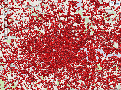
This is much more pedestrian, but uses Google Maps, so it’s more likely to be the type of thing that reporters could do themselves. It plots bases in the U.S. from which military drones are controlled.
The NYTimes got a lot of attention during the 2012 London Olympics for their look at how the winning times for the 100-meter dash had shortened over the years, and justly so. The app conveys a lot of statistical info in an easy-to-grasp format.
Slate did its own, and it’s a useful comparison with the Times’, which is more impressive graphically but probably took a lot longer to produce.
One great interactive collection, though, is here: Florida Today’s impressive graphics about the U.S. space program. They’ve been doing it for years, and it shows.
Jan. 28 update – NY Times deputy graphics director Matthew Ericson spoke at our Hack Jersey event and described how some of their best multimedia apps were built, including the Olympic sprinting event I mentioned above. Check the Hack Jersey post for video of his entire speech.
