Archive

Online Journalism

WhereWeEat

Well, at least the basic version is free.

Go to vennage.com to sign up.

They have a lot of basic templates for charts and a decent selection of infographic templates as well.

For $19.95 per month, you get a few more templates, in particular, a map of the U.S. that allows you to display data for each state, plus the ability to publish your graphic as a pdf file. Of course, with the free version you can just do a screen grab and embed that. With the free version, you can only have five infographics live at a time, which might crimp your style for regular usage, but isn’t an issue for occasional work.

The graphic above is one I created for a class, using some data from a Google Forms survey asking students where they ate on campus in the previous week.

Every part of the template is customizable, generally by clicking on the element, which opens up a panel.

If you’ve discovered a better free or inexpensive tool for creating charts and infographics, let me know.

JQueryTimelineEx

KnightLabs is giving away a nice tool to create timelines, using Google Spreadsheets.

I was trying to embed it here but realized I can’t do that since I’m using WordPress.com instead of WordPress.org, so that type of embed is not allowed.

But you can click on the link to see the timeline live.

It all works off of a Google spreadsheet that organizes the media and text, which is then published to the Web and a link thereto is embedded in your blog.

Seems to be very powerful, though I have yet to play around with trying to change the media.

http://cdn.knightlab.com/libs/timeline/latest/embed/index.html?source=0Aq1-X7G089O0dHJHMHk4Zzl4TmRUcFFsUG5GV2xtNnc&font=Bevan-PotanoSans&maptype=toner&lang=en&height=650

QuartzCoverQuartz (qz.com) has been one of my daily must-reads since I discovered the site over a year ago. Created by Atlantic Media (which also runs The Atlantic magazine and TheWire.com) Quartz covers international business, sort of. I say sort of because, unlike the Wall Street Journal or even The Economist, Quartz makes no attempt to cover everything. Instead they focus on what they call “obsessions”, which are business topics they believe are really important. For Quartz, that includes China, India, Technology, Media and a regular list of quirky stories that often offer insight into topics you don’t know are important until Quartz writes about them.

But besides being serious, funny, and well-written, Quartz has also drawn attention for its radical Web site design. Most Web sites use a hub-and-spoke design, with a cover page filled with links to individual stories. Not so with Quartz. Type “qz.com” into your browser, and you see the site’s top story, usually topped with a browser-wide photo. Scroll down the first story and you’ll find a second and a third, right on down through an occasional “sponsored” advertorial to the point, maybe 30 feet down, where the scroll ends and you know you have read everything Quartz has posted for today.

Yeah, they add stories throughout the day, but the point is, you start at the top story and read through everything new on the site until you come to the last story you remember reading from your last visit and then you know you’ve finished, read the entire site, and can move on. It’s a feeling much like the one you got from newspapers and magazines. When friends told you they’d read the paper this morning, you know they meant they had skimmed the entire paper from front page to last and at least glanced at all of the headlines.

You can’t do that with nytimes.com or wsj.com or Buzzfeed or Reddit or whatever is your info-source of choice. There is no way to determine when you have looked at everything new since the last time you visited or everything posted in the past 24 hours or whatever.

I loved the design, both for the feeling of completeness I got and also because Quartz was violating every rule of the tired, tired, TIRED look that most news sites have today.

So imagine my chagrin this week when I go to Quartz and discover that they have regressed back to the mid-1990s and added a home page.

Instead of one story at the top, you now get “The Brief”, a digest of the top 10 news stories of the moment. Below that is a great example of what happens when designers are allowed to build web sites without someone from editorial standing behind them with a baseball bat. It’s called “Top Stories on Quartz” and consists of browser-wide photos cropped at an unworldly 10:1 ratio, then darkened, with a headline overlaid. Does the person who “designed” this view the outside world through the slits in the walls of a maximum security prison? No camera takes photos in this ratio naturally and it is very hard to crop stock photos (which is what Quartz uses for most of its articles) to fit properly. So Quartz’s new “cover page” is 10 grafs of text followed by a dark blotchy scrolling mess.

Frankly, I’m disappointed. But I’m very interested in the results of the experiment.

I love the original design. I found that I almost always scrolled down all the way to the bottom of the page and in the process, I read stories that I would not have read if they had been on a traditional hub-and-spoke cover.

With the new design, I find that I skim the index, often see nothing of apparent interest–or, just as importantly, get enough information from the index that I feel no need to click to read the individual story–and move on to another site. That’s certainly not an improvement.

There is a workaround: I’ve quickly learned that if I click on the first story without reading the index I get the original design, with its 30-foot scroll, so maybe Quartz can have the best of both worlds–keeping those of us who like the old, very different approach to web design, while still attracting new readers who need their index.

But I wish Quartz would give us some data on how folks are using the design. Once readers come to an individual story through the new Index or from social media, they jump into the old, scrolling, design. Unlike most other sites, Quartz leaves the sides of the page bare, with no links to other stories or sections. So does scrolling work? How far do most readers scroll before leaving the site? Does the new index drive more traffic from click-throughs than previously scrolled down from the top of the old cover?

My two cents: I believe Quartz’ real problem is not its scrolling non-cover page, but rather that it has spent too little time and effort promoting qz.com and instead has focused too much on social media to promote individual stories. According to NiemanLabs (see article, here), 90% of Quartz’s readers are coming to the site from individual stories and only 10% come directly to the cover page. That sounds drastically wrong. Yeah, lots of folks are using mobile to access the web, but Quartz readers strike me as folks who read from their desktops, so that ratio seems way out of line.

The new design allows readers to skim the site rather than scroll through it, so it seems likely, to me, that fewer readers will click on the index than scrolled down previously. I hope Quartz will share their user data to let us know if that is true or false.

And given how little effort Quartz puts into moving readers from one story to related stories, once they come to the site, their new design seems a big step backward rather than forward. Coming from a site that has been so impressive both with the quality of its work and the boldness of its design, that is a huge disappointment.

Firestorm
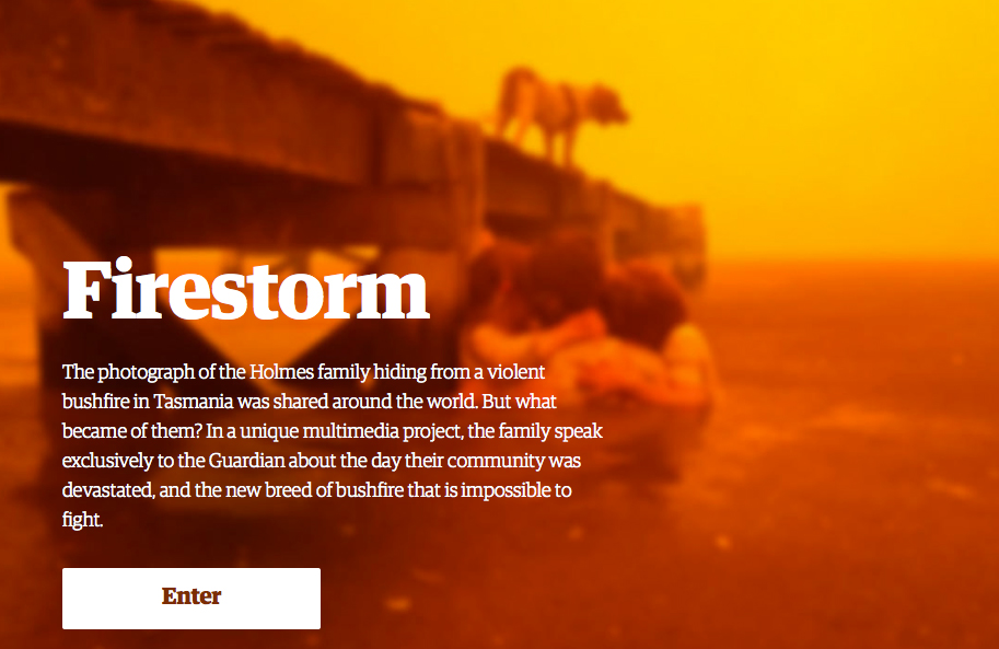
In “Firestorm,” an exceptional multimedia look at how a Tasmanian family escaped a devastating wildfire, The Guardian gets right what the New York Times couldn’t figure out in its Pulitzer Prize-winning epic, “Snowfall.”
__________________________

Read/watch ‘Snowfall’ here.

Read/watch ‘Firestorm’ here.
__________________________

There are two reasons “Firestorm” is so much better than “Snowfall” — One, The Guardian team rejects interactivity (letting readers control the story) and instead uses advanced web coding to force the reader to experience ALL of the mutimedia, along with the text, as they progress through the story. And secondly, The Guardian team really understands the power of video, blending that video with text in a compelling fashion to ask whether one family’s race to escape a fast-moving fire may portend Australia’s future in the face of climate change.

In “Snowfall”, the Times told the story of how three members of a group of veteran off-trail skiers in Washington State’s Cascades died in an avalanche.The project was notable for its extensive use of multimedia, some CSS tricks, and of HTML5, the latest upgrade in Web coding standards.

The 17,000-word text was peppered with photo galleries, video clips and links to audio interviews, and each section of the narrative began with a short video loop showing snow falling or clouds moving over a mountain landscape. Several 3-D maps clarified the terrain where the tragedy occurred and a particularly effective bit of animation displayed the avalanche as it occurred, in real time.

But The Times project merely glommed those impressive multimedia elements onto the text. There was never any doubt which medium was dominant. You might stop reading to watch a video clip or animation or to scroll through a photo gallery, but then you went back to the text.

The dead giveaway was where The Times stuck their mini-documentary, an 11-minute video narrative. The video was compelling, capturing the grandeur of the Cascades, the drama of the avalanche, the sorrow of the survivors. And where did The Times put it? Dead last, at the every end of those 17,000 words.

If the video had been at the beginning, where TV-based Web sites such as NBCNews.com would have put it, then who would have read those 17,000 words of text?

My point is not to criticize the placement of the video so much as to point out that the Times did two separate versions of the story — one in video and the other in text, with some multimedia elements thrown in.

What they did not succeed in doing was to combine those elements into one narrative.

The Guardian’s “Firestorm,” on the other hand, melds text and audio and video in a way that fulfills the 15-year-old promise that the Web will usher in a new form of multimedia storytelling.

In “Firestorm,” you don’t alternate between text and video. The text is overlayed on the video. A photo filling the entire screen scrolls up and comes to life — a family member explains when they first realized that the flames were a threat, a firefighter tells of the futility of fighting such a gigantic firestorm.

And then the video ends and it’s time to scroll down for more text. In “Firestorm,” text doesn’t try to do what video does best — capture the emotions of the trapped family, describe the look of the flames as they top a nearby ridge, or show the devastation of the fire.

Photos of the family, as they huddled beneath a pier in the lake below their burning house were featured by the news media across Australia in stories about the fire. In “Firestorm,” that is mentioned, but the text never describes the photos. Instead they are shown, while mom tells how, even as the flames crept closer to the dock where she and her children were huddled, she realized she had her cellphone and asked someone to take some photos.

The point is a simple one, but critical — The Guardian staff understands that with video, the images tell their own story. There’s no need to add text.

In The Times “Snowfall,” in contrast, reporter John Branch seems to have written his story with no thought of any accompanying media. A female skier, who was caught in the avalanche but thanks to a safety vest survived, explains in a video how she thought she was dying. And sure enough, the text repeats the same quote. Branch writes eloquently of the joys of skiing in thick powder snow, while, a few column inches away, a well-shot video clip does a far more effective job of showing that joy.

“Snowfall” was an eye-opener, an intriguing showpiece of what you can do with HTML5, video and 3-D graphics. But if “Snowfall” showed the potential, “Firestorm” is the realization of that potential.

The video and photos don’t sidetrack a reader from the print narrative — they are part of the narrative. In “Snowfall,” the text worked as a standalone story, as did the 11-minute video. Drop either element, and the other was just fine. Not so in “Firestorm.” Finally, someone has used coding so the authors can be sure that readers have read and seen all of the multimedia elements as they move through the story instead of tacking photo galleries or video clips or interactive maps on the side, with no assurance that anyone is looking at them.

For the past 15 years, those of us in the multimedia storytelling business have promised more than we have delivered. “Rashomon”-like, we’ve told a story from different perspectives — hey, look at my video, here are some photo galleries, maybe an interactive map and, of course, a text story that stood on its own. Each medium provides one look at the story, in ways that TV or print publications can’t do, but ultimately they haven’t really worked together.

With “Firestorm”, The Guardian shows the way to true multimedia story-telling.

Now if someone on their team will just lay out in detail exactly how each element worked, so the rest of us can learn from them.

UPDATE: When I wrote about the value of Flipboard’s user-created magazines a couple of days ago, one of my major complaints was that folks could see them only if they own an iPad, smartphone or Android tablet. Well, the FB folks have fixed that. As of today, I (or any other FB user) can mail you a link to my magazines or post a link on social media, and when you click, the magazine opens in your Web browser. This vastly expands the utility of the magazines, since you can now let anyone see them. Here are links to three of my magazines, on Web Video,  Photos, and Data Visualization.

My purpose in creating these is to collect stuff on a given topic that I can then use in class, and now I can use FB’s web page to organize each magazine and then mail links to it to students at the beginning of class.

HINT – Once you open one of my magazines, click on the small icon at left with three short parallel lines. That will take to FB’s choice of best user-created magazines.
___________________________________________________________

I’ve been using Flipboard’s new “Create Your Own Magazine” feature for about three months now, so it’s time to report on how it’s working.

I’m basically very happy with the software, that allows you to store your Web page bookmarks as “magazines” on Flipboard, displayed in the software’s unique layout.

For now, Flipboard is only available for iPads and iPhones, Android, and Windows 8 phones. The basic application allows you to select feeds from Twitter, Facebook or various magazines and pull them into Flipboard. The app then displays the headline, photo or illustration, and the first 1-3 grafs of the content, laid out magazine-style, with 2-6 items on a page. You turn the pages by sliding your finger from right to left, “flipping” them.

FlipboardCover

It’s a far better way to browse a Twitter feed featuring links or photo, e.g., because you don’t just see the url — you see the actual photo or article headline, along with the first few paragraphs of the text. Content from several dozen Web sites, including The Economist, Salon, National Geographic and The Guardian, are also available, in the same format.

But about three months ago, Flipboard announced a new feature that allows readers to create their own magazines. First, you set up your magazines, by title and category. For example, I created magazines for Photos, Data Journalism, Web Video, Teaching, Journalism, Mobile apps, Gadgets and Music.

Now, as I browse content on Flipboard, a small plus sign is visible to the side of every article, and if I want to save it in one of my magazines, I just click.

Far more powerful, however, is a Pinterest-like feature that allows me to add a link to my Firefox or Safari browser. With that installed, whenever I am browsing anywhere on the Web, I can click on the “Flip” link and a window pops up, allowing me to add the link to one or several of my magazines.

You may be asking how this is any different than just storing the URLS for those Web pages in my bookmarks folder. At a basic level, there is no difference. I generally add both a bookmark and “flip” the link to my Flipboard magazine whenever I find something of interest.

But Flipboard’s magazine-style layout makes it much easier to find a URL long after you’ve forgotten why you saved it. By displaying the headline, photo or video or illustration and the first few grafs of a story, you can quickly remember what the article is about.

Here’s a quick illustration of that comparison. Below is a screen shot of my bookmarks folder for Web video (OK, I could do a better job of organizing it):

BookmarksWebVideo

Now here are several pages from my FB magazine for Web video:

FB5

Your magazines by default are public, so they can be followed by anyone else interested in your topic. At some point, for example, I could send a note to my fellow online journalism professors across the land, letting them know that I have collected several hundred links to great examples of web video, available for their classroom use.

photo

Flipboard has already made one upgrade to the service. About six weeks ago, they announced a Web page where you can log in and edit your magazines. You can drag and drop each item into whatever order you like, and you can also create a permanent title page for your magazine (by default, Flipboard uses the art from your most recent post as the cover page art).

FB7

There are still some missing pieces for Flipboard to be more useful. I’d like to be able to write new headlines for the articles, e.g., and I’d like the ability to create subsections. For example, in my Photos magazine, I’d like to have one section for great examples of photos, another for photo gear, and a third for how to take photos.

And most importantly, I’d like to be able to share the content on the Web and not just on a tablet or smartphone. Most of my students have laptop computers, but almost none of them own a tablet computer.

Apr 11, 2013, 3-53-06 PMIf you’ve glanced at fashion Web sites lately you may have noticed a striking new image — what appears to be a still photo, but with a small portion moving, seemingly in a loop.

The images are called “cinegraphs,” a name copyrighted by photographers Jamie Beck and Kevin Berg, and they first started using them in 2011.

One of the first examples was during Fashion Week in New York City that year (click on New York Fashion Week): http://cinemagraphs.com/

They seem to be gaining mainstream acceptance. Here’s a recent example from People magazine.

http://www.people.com/people/static/h/package/mostbeautiful2013/gif/index.html

Here’s a good overview article with lots of good links:

http://columbianewsservice.com/2013/03/wait-did-the-picture-in-that-ad-just-move/

I decided to show my multimedia news production class how to produce them, which required learning the process myself. (One of their best is the one of the two flags at the top of this post). There are two approaches, one using Photoshop (I’m guessing you could also do it in GIMP or Photoshop Express, not sure about Pixelmator) and the other using an app for an iPad, iPhone or Android tablet or smartphone.

Here’s an Android app:
http://www.makeuseof.com/tag/make-animated-gifs-and-cinemagraphs-android/

Here’s the iPhone and iPad equivalents:

Echograph.com
Cinegram.com

https://itunes.apple.com/us/app/cinemagram/id487225881?mt=8

The app approach is much simpler, though it doesn’t offer all the capabilities of Photoshop.

My guess is that we will see a lot more cinegraphs because coming up with a good one takes some thought, the sort of process that both video and still photographers enjoy.

First, you need at least two elements of your image that are moving. The goal here is to freeze one of them and let the other continue to move. But you need to be careful that none of the elements in the frozen portion of the image move behind the image you want to move. When an element is moving, it swings from side to side or up and down, revealing part of the background and if anything moves through that background, it will spoil the effect. So your moving element should be in front of something that is stationary. That was a problem in the third-from-the-bottom image below, where the runners ran behind the young woman. We had to freeze the right side of her skirt, since when it blew to the left, it would reveal the runners when they passed behind her.

Your frozen image also takes some thought. You want the reader to recognize instantly that some of the elements in it were moving but now have been frozen. In the bottom image in this post, e.g., it is not immediately obvious that the young woman is not just sitting very still. In the one above it, on the other hand, it’s clear that the person walking has been frozen while his shadow precedes him.

With an app, such as Echograph, the real headache is in getting the video into and out of your smartphone or tablet. That requires loading the video into your computer, opening iTunes, selecting the Apps window, and scrolling down to where data can be transferred via iTunes from your computer to the app, and then loading the video (the folks at Echograph are also selling an SD card reader that attaches to the phone or tablet, allowing you to transfer the files directly from your camera).

But the process of creating the cinegraph is idiot-proof. Open the app, open the video and hit Play. Stop when you find the frame you want to freeze and then, using your finger, erase over the part you want to continue moving. Voila! Instant gratification and you can share your creation via e-mail or social media.

Photoshop is harder, but offers more options. I didn’t realize you could import a video into Photoshop, but you can. Under the File menu, select Import and you can select “Import Video to Layers.” That puts each frame into a separate layer and you can even trim the front and back of the clip to reduce the file size. You then need to stack the layers, add a mask over the part you want to reveal and after a few more steps, create your cinegraph.

It’s a complicated process, but it offers two advantages over the app version. First, in Photoshop you can select your frames and then paste them in, in reverse order, so your video moves forward and backward to the beginning in a smooth-flowing loop. The app versions also play the video as a loop, but at the end of the clip, there is a jump cut back to the beginning. By reversing the frames, the image seems to be in perpetual motion. Secondly, in the apps, you use your fingertip to reveal the underlying image. That’s normally sufficient, but it doesn’t offer the pixel-level control of Photoshop.

Here are the detailed instructions:

http://blog.spoongraphics.co.uk/tutorials/how-to-make-a-cool-cinemagraph-image-in-photoshop

One other point – you absolutely must use a tripod. If one part of your image is frozen, any camera shake at all in the moving portion will be accentuated.

Here are a few of my favorite images from our class:

Apr 11, 2013, 3-50-26 PM

Apr 11, 2013, 11-19-29 AM Apr 11, 2013, 11-30-54 AM Apr 11, 2013, 11-04-22 AM


FlipboardFlipboard, one of my favorite iPad apps, has a Significant Upgrade.

Here’s their take: http://flipboard.com/

First, if you’re not familiar, Flipboard takes links to content from the web and organizes it on the iPad into well-designed magazine-style pages that you can turn by “flipping” the pages. It’s free, and particularly useful in helping you to read your Twitter and Facebook feeds. With Twitter, for example, it takes your feeds and instead of showing you the text only, separates out those tweets that also include a link to content. Instead of just the text, you get the text as a headline, plus the first 1-2 grafs of the article the tweet links to, as well as any art accompanying the story. So instead of clicking on every link in your Twitter feed to see what’s attached, you can “flip” thru Flipboard and quickly decide which linked-to articles are worth further reading and retweeting. It works the same way on Facebook and several dozen Web sites or magazines provide their own feeds (Salon, The Economist, The Guardian, Nat Geo, Neatorama, Nieman Lab, e.g.).

What Flipboard does really well is to curate content and display it in an appealing format. Yeah, there are occasional hiccups, but often you get striking images with text super-imposed, or magazine-quality pages assembled by an algorithm — dozens of them.

Which is why Flipboard’s latest announcement, that you can make your own “magazines”, is so intriguing. The app has always allowed you to mark a story as a Favorite or to retweet it or e-mail it to friends with a simple tap on the screen. So when I’ve rambled across something I want to come back to later, I generally retweet it and then e-mail it to myself and then click on the link to open the Web page, and save it to a folder in my Bookmarks. Not very efficient.

So what’s new? Now there’s a small “+” sign added to the margin of every article. If you “like” the story/video/photo, as you can do with Pinterest and several other apps, you can add it to your own magazine. With Pinterest, which is photo-based, that is a “board”, a web page that includes favorite images that link to the web pages on which you originally found them. But on Flipboard, you don’t just get a page of photos — you get the Flipboard magazine-style layout, page after page, which you access by flipping each page.

That’s nice, for the iPad, but there is more. Go to the Flipboard home page and you can add a button to your bookmarks bar for Firefox (so far, that’s the only browser in which this works, though more are promised). As with Pinterest, once that is in your browser’s bookmark’s bar, clicking on it automatically brings up a window with images of the magazines you have created. Find a great article on the Web? Click, and Voila! it’s added to your personal magazine on the iPad. Want to add it to one you have yet to create? Just create a new one and give it a name and description.

The magazines can be private or public, so again, as with Pinterest, we can assume we’ll soon be able to follow obsessive folks who have curated (collected) content we like and add it to our own magazines.

In the past 1-2 years, the idea of curation has drawn a lot of attention as a way to use both human editors and algorithms to search through the ever-growing haystacks of content on the Web to find the insightful needles worth your attention. The idea isn’t new — whether it is the Drudge Report, Boing Boing, Reddit, Digg, Google News Alerts, Sulia, TrapIt or some hours-old alternative. But what Flipboard offers is a smart, attractive interface that gives  you a deeper view of the content before you have to decide whether or not to click.

Now, with the ability to easily create your own Web magazines, Flipboard makes you an über-curator, with the power to organize what you believe is meaningful and to share it with friends and the outside world in an attractive format.

I’ve spent the past week building five magazines, for Web video, Photography, Social Media, Journalism, Teaching and Favorite YouTubeMusic Videos. None of them have enough content yet to show off (and I need to figure out how to do a screen grab on an iPad). But the potential seems clear — this is really something useful I could share with students or the real world without a lot of effort. Do it over several years, and it becomes a series of well-designed, graphically rich Web sites that you can build one article at a time, a form of iBook publishing that is free and easy and impossible not to recommend.

FOOTNOTE: What’s not to like? Currently content is last in on top, just like your blog. So you can’t drag stories around to arrange them the way you’d like. You also can’t create subsections for sub-topics. I have a magazine for Photography, for example, and I’d really like to have subsections for photojournalism; how-to articles; stories about Canon EOS DSLRs, since those are the ones we use at Montclair State; striking individual images; and perhaps photo galleries including those with audio. I also can’t add context to the content myself, either through text or some other form of organization. My ideal is for this to become a textbook or at least a complement to a textbook. Right now, it is just a much more attractive alternative to my Bookmarks folders.

The other obvious issue is that Flipboard only works on an iPad and NOT on the general Web. The reason is obvious — it works like a magazine. You swipe with your hand to turn the pages instead of scrolling down a Web page. That highlights a battle I think is one of the most important we’ll see played out on the Internet in coming years — whether we continue our scatter-brained, everything-but-the-kitchen-sink Web page design of the past 17-18 years, based around Web pages that scroll down indefinitely, or whether smartphones and tablets, which emphasize individual pages that cleanly fill their entire screen and are navigated by touch to “turn the page” win out. Personally, I’m a big tablet/smartphone fan, since that schema lets designers know the real estate they have to work with and design accordingly. But that’s the topic of a later post.

I have a general thesis that free video on the Web is going to put a serious crimp not just in the commercial TV programming we know now, but also the wannabe Web-only equivalents, the sorts of folks who count on paying for their Web video shows by making money from  advertising (such as the 100 projects Google has green-lighted and the ones NetFlix and Amazon are also backing).

The links here are fairly broad — a couple of music clips, a seminar, some crazy stunts — but they’re what I ended up watching the past few days instead of cable TV. I think this sort of free programming still has lots of room to grow. SmartPhones are still getting better in terms of video and audio, and they’re still spreading into every corner of the globe. There are now hundreds of thousands of folks using DSLRs and high-end point-and-shoots to shoot better-quality video, and folks like GoPro, with their affordable cameras aimed at extreme sports enthusiasts, have shown that a key requirement for participants is the ability to show your friends what insane stuff you did. Oh yeah — Google Glass goes on sale this year and if it’s wearable video cameras get any serious traction, it will add millions more cameras out there capturing everyday life in all its humor and pathos — for free.

So tell me what you watched on the Web this week… Are you watching more or less cable TV?

Enough talk — here are the links:
Two gutsy/foolhardy guys jump out of ultralights over Rio at 5:45 a.m. wearing those flexible wingsuits that allow them to sort of fall/glide to the ground — right through two towers of an office building. Free content from extreme sports enthusiasts.

Love baby seals? A guy in Seattle mounted a camera on an old surfboard and watched what happened. Free content from an amateur videographer with some imagination, and luck.
http://www.viralviralvideos.com/tag/gopro/

I didn’t watch all of this (yet), but in the first 20 minutes I learned a lot about how National Geographic photographers get those great photos. On average, they shoot 1,900 for every one that appears in the magazine. I teach photojournalism and that’s a key point for students to learn — no matter what your technical settings, you need to keep shooting to get the very best photos. The seminar was sponsored by Samsung at B&H Photo in New York, which is another point. Remember that incredible balloon jump last year by Austrian daredevil Felix Baumgartner? It was sponsored by Red Bull. Remember that theme — advertisers don’t need to put their ad on your video product. They can create THEIR video product and bypass your cable network.
http://www.petapixel.com/2013/03/16/storytelling-made-easy-capturing-photos-that-tell-a-compelling-story/

This one is more technical — two guys use a bunch of GoPro video cameras mounted on an arc-shaped metal bar to recreate those “Matrix”-style videos where the image freezes but then the camera moves around within the frozen image. But that’s another point — As a photography nut, this is niche info I can’t find anywhere on cable TV and there are thousands of similar niches, from knitters to mandolin players to folks who want to learn to swing dance or program C++.
http://www.viralviralvideos.com/2013/03/16/homemade-gopro-camera-array-creates-stunning-matrix-style-bullet-time-visuals/

Chris Thieles is one of the best mandolin players in the world today, though you wouldn’t know that from watching this entertaining clip of his group, The Punch Brothers, cover a song by The Cars. Again, the clip was done by a Web site for promotional purposes, so I don’t have to watch a 30-second ad before the clip.

This one is from an art exhibit — a fascinating (and highly edited) slow-motion drive through New York City. Yep, this time it is a non-profit that is giving us the free video.
http://www.petapixel.com/2013/03/17/street-a-mezmerizing-slow-motion-drive-down-the-streets-of-nyc/?utm_source=feedburner&utm_medium=feed&utm_campaign=Feed%3A+PetaPixel+%28PetaPixel%29

PS – I started putting the actual links in because this WordPress template doesn’t do a good job of highlighting linked text. It adds a faint gray underline that is easy to miss.

That’s it for now, but I’ll add more on occasion, whenever I see stuff that proves my point: The Web isn’t just disrupting traditional media. By offering a huge amount of free content and allowing advertisers to create content themselves, it is completely destroying the traditional model where someone produces content to attract eyeballs and then sells those viewers to an advertiser to finance the costs of producing the content.

An item last week in the always-excellent 10,000 Words blog outlined why Reuters and the Wall Street Journal were parting company with YouTube. You may remember that — only a year ago — both companies trumpeted their selection to produce content for a YouTube channel, one of 100 premium channels the Google-owned web video giant spent $150 million to launch last year.

YouTubeSo what went wrong? One place to start, 10,000 Words points out, is the money that YouTube pays for traffic to its channels. They cite an article by Peter Kafka in All Things D, that claims YouTube takes 45% of all ad revenue as its cut, leaving the content producers with revenue of only about $2.50 for every thousand viewers. Yep, that would be $2,500 if your video gets one million views.

Or, to parse the data another way, assume a staffer makes $65,000 a year, which translates neatly to $1,200 per week or $250 per day. Just to earn back their daily salary, that video producer is going to need to produce content every day that reaches 100,000 eyeballs (at YouTube’s rate of $2.50 per thousand eyeballs). Assuming you have multiple staffers on your team, EVERY ONE OF THEM is going to need to produce a video that hits that 100,000 views mark every day.

How likely is that? 10,000 Words points out that a recent highly-trafficked New York Times video netted 330,000 viewers — not per day, but in total.

We’re off here by a factor of at least 10 and that’s what keeps me worried about the future of commercially successful video on the web. And that’s now — before the floodgates open and we see a surge of user-generated streaming video from the likes of UStream and Google Glasses, all free and all competing for those same limited eyeballs.

I don’t want to end on a dour note, so in fairness, I should point out this story about a spiffy new video production facility YouTube just launched in Los Angeles called “Space.” It’s state-of-the-art with green screens and cool camera and editing gear — and it is available for free to folks YouTube allows in to produce premium video content. The goal, according to YouTube, is to give new producers access to better gear so their productions will look more polished. If the cost of producing content were the major roadblock to producing commercially successful content on the Web, I’d say this is a great idea. But it’s not. A couple of HD cameras and a laptop with editing software are within the reach of most wannabe producers, particularly if a few friends pool their resources.

Nope, the enemy of commercial web content is free web content. And who is the biggest purveyor of that in the land? Ironically, in light of this latest venture, it’s the folks at YouTube.

Can Glass break Rock?

Can Glass break Rock?

One of the most striking features of the stories about the Russian meteorite was the volume and quality of videos capturing its blazing arc across the sky. You would have thought that half of the autos in the small town where the meteorite crashed had cameras mounted on their dashboards. And you would have been correct.

Because drivers in Russia don’t have a lot of faith in the ability of their court system to correctly assess who is at fault in an auto accident, many have mounted small cameras in their cars to record a few minutes of video into a buffer, which can be saved in the event of a crash — a persuasive bit of evidence in court.  And as a result, video of car crashes is a popular subject on the Russian versions of YouTube. See here, for example, for some highlights.

You rarely see auto crash videos in the U.S., because they happen suddenly, before anyone can turn on a camera. The ones you do see are often from cameras mounted on police cars, similar to those in Russia.

But Google seems close to changing all of that, and in a way that may transform what we now know as commercial TV.

Watch the video embedded in this PopSci article on Google’s hush-hush meeting with developers recently in New York. The session was to show selected developers the latest iteration of Google Glass, the eyeglasses the Web search giant has been crafting that allow users to overlay info from the Web onto the real world.

Up to now, the glasses have seemed intriguing, but not revolutionary. Curious about what it costs to live in a ritzy neighborhood in northern New Jersey? If you’re wearing the glasses, just ask Google to overlay data from Zillow or Trulia or some other Web-based real estate firm onto your vision and you can see what houses have sold for recently, as you look at them. Thinking about stopping at a new ethnic restaurant while running errands? Ask Google to call up Yelp reviews and display them right in your vision. Intriguing, yes, but not that more advanced than what I can already get from a smartphone.

But as this latest video makes clear, Google is far more ambitious. Now the glasses have voice control, and the ability to record video and stream it live to friends. Just tell it to “Start recording” and a small image of what is being captured shows up in one corner of the glasses. Tell it to “Start Hangout” and it begins streaming the video live, allowing up to 9 friends to join in a Google Hangout video chat session, texting their reactions to what you’re seeing. And Hangouts have a URL, which anyone in the world can access.

In other words, anyone wearing Google Glass becomes a TV producer, streaming live whatever they are seeing, and anyone in the world with Web access can watch. That’s a big step up from dashboard-mounted video cameras in a small town in Russia.

Just a few months ago, Twitter was being touted as a revolutionary tool for journalists because it allowed them to monitor what was happening with the “Arab Spring” protests in Egypt and elsewhere. Imagine if even a fraction of those protestors had been wearing Google Glass. When protestors outside the 1968 Democratic convention in Chicago chanted “the whole world is watching” before the cameras of the national TV networks, they were right. Until the cameras went away.

But what if anyone, anywhere could show everyone else what was happening? Not just protests — walking tours, traffic jams, nightclub performances, crime scenes, plus the more mundane examples of classes, lectures, museum visits or local sports. YouTube today seems bottomless, but it would be dwarfed by the Google Glass output.

Would commercial TV as well? If the print media’s experience with the Web is any guide, today’s broadcasters should be wary.

When Web news and information sites first launched, they were touted as better replacements for stodgy print media — allowing the use of text, photos, video, interactive graphics and interaction with readers at a lower production cost, all ad supported of course, just like their predecessors in print. But what has slowly been dawning on Web journalists is that they are not the only folks out there who are talented writers, photographers or videographers. There are thousands of people who are passionate about something and willing to produce content about it, for free. As a result, the volume of quality content has increased exponentially and as a result, commercial news and information Web sites producing original content have never been able to attract enough readers to charge the same advertising rates as print media.

Is the same fate in store for the TV industry? There have been many articles recently touting the success of web-only commercial video. Google itself is funding 96 start-up channels via YouTube, and NetFlix was in the spotlight for its release of a second season of House of Cards, it’s Internet-only dramatic series.

But TV producers have always appreciated the power of “live,” for viewers to sit forward in their chairs to experience “being there.” That’s what Google Glass offers. Tens of thousands of live streams, on any topic imaginable. Yeah, some folks never get beyond the first dozen channels on their cable box, but lots more will find niche programming that will take them away from commercial TV.

And that is not good news for traditional producers counting on large audiences to cover large production costs.

But can Google pull off the Glass revolution?

Six years ago, there was no iPhone. Now, many of us would say our smartphone is our most valuable possession. No, Google doesn’t have Apple’s track record with launching consumer gadgets, but they have billions of dollars to invest and if this latest video demonstration is any indication, they’re figuring out a great feature set. My bet is that Glass will have some early hurdles, but eventually will win wide acceptance.

So in six years, when the next meteorite hits, don’t flip over to CNN. Click here to watch it live.

One Man's Guitar

One man who's got something to say about...

The George Macy Imagery

The Literary Art of the Limited Editions Club and the Heritage Press

The NP Mom

Answers to questions, you always forget to ask!

David Herzog

Thoughts on What's New in Journalism

MultimediaShooter

keeping track, so you don't have to...

Reportr.net

This blog on media, society and technology is run by Professor Alfred Hermida, an award-winning online news pioneer, digital media scholar and journalism educator.

MediaShift

Thoughts on What's New in Journalism

andydickinson.net

online journalism, newspaper video and digital media

InteractiveNarratives.org

Thoughts on What's New in Journalism

MediaStorm Blog

Thoughts on What's New in Journalism

Journalism 2.0

Thoughts on What's New in Journalism

Online Journalism Blog

A conversation.

LostRemote

Thoughts on What's New in Journalism

Poynter

Thoughts on What's New in Journalism

BuzzMachine

The media pundit's pundit. Written by NYC insider Jeff Jarvis, BuzzMachine covers news, media, journalism, and politics.